Websites shaped around how customers choose.
These concept projects show how Tyvaro turns different business needs into clear, credible digital experiences. Each one explores a distinct customer journey while keeping trust, clarity and action at the centre.
Self-initiated concept work created to demonstrate our approach.


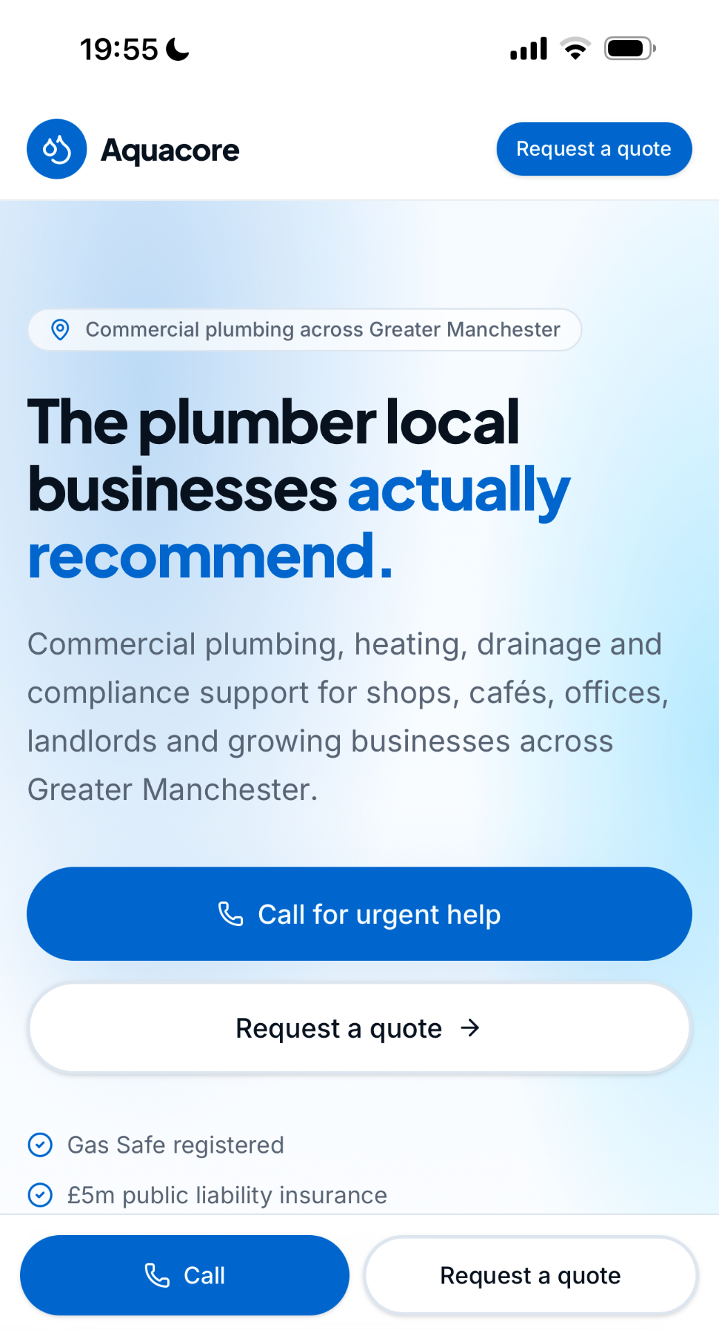
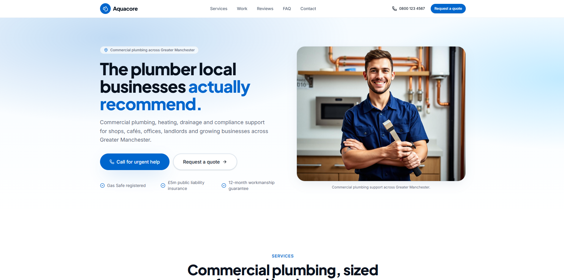
AquaCore
A clearer route from urgent need to confident enquiry.
- Industry
- Commercial plumbing
- Primary focus
- Enquiries and trust
- Experience
- Desktop and mobile


Overview
Commercial plumbing customers often arrive with a specific problem and little patience for vague information. AquaCore was designed to communicate capability quickly, make service routes easy to understand and move visitors towards an enquiry without making the experience feel pushy.
The challenge
Many trade websites bury important information beneath generic copy or fragmented service pages. This concept needed to establish professionalism quickly while keeping urgent and planned work equally easy to navigate.
The approach
Direct messaging, strong hierarchy and prominent contact routes create a dependable, practical experience. The visual system is structured and controlled, allowing the business to feel established without losing speed or clarity.
Key design goals
- Make services and coverage easy to understand
- Build trust quickly through clear commercial messaging
- Keep enquiry routes visible without feeling aggressive
- Create a strong experience across desktop and mobile
The composition alternates between structured information density and generous breathing room, so the site can carry technical depth without overwhelming a customer who simply needs help. On mobile, the same hierarchy reduces cleanly — call and quote actions stay within reach as the visitor scrolls through service and coverage detail.


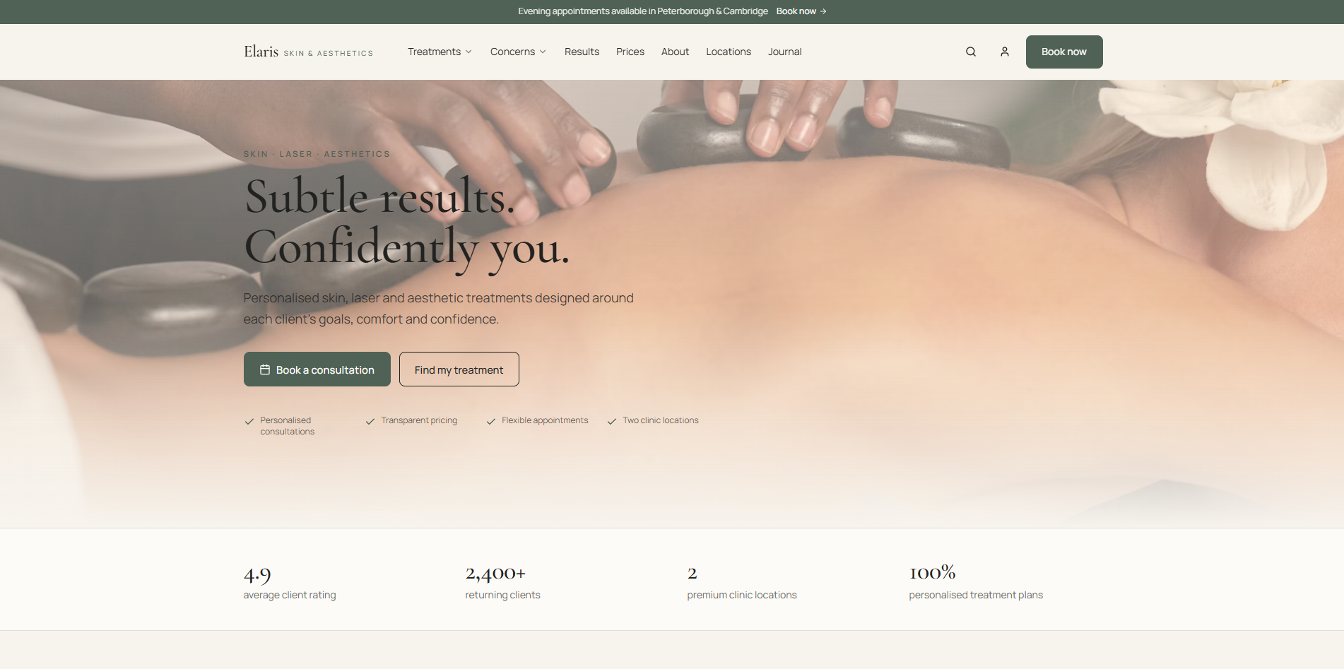
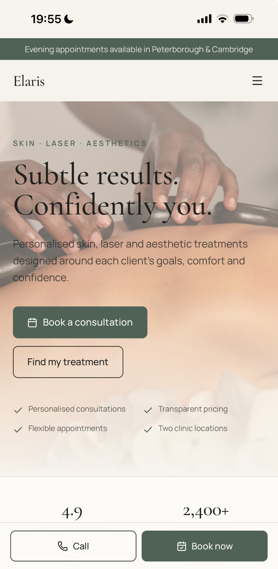
Elaris
Premium care without losing clarity.
- Industry
- Aesthetics
- Primary focus
- Trust and booking
- Experience
- Desktop and mobile
Overview
Visitors to an aesthetics website need reassurance as much as inspiration. Elaris was designed to feel calm and elevated while keeping treatments, pricing and booking information easy to understand.
The challenge
Premium aesthetics websites can become visually beautiful but difficult to use. This concept needed to balance aspiration with the practical questions customers ask before they feel ready to book.
The approach
Editorial spacing, refined typography and soft visual pacing create a premium atmosphere. Clear treatment discovery and booking prompts keep the customer journey purposeful rather than purely decorative.
Key design goals
- Create a calm, trust-led presentation
- Make treatments easier to discover
- Give pricing and booking clear routes
- Maintain a polished experience across devices
Elaris leans into editorial rhythm — quieter type scales, softer surfaces and a slower pace of content — while keeping booking and treatment information a single decision away. The mobile design carries the same tone, treating small screens as the primary place customers will actually explore treatments and book.
Different industries. The same commercial discipline.
Clarity before decoration
Every page should help the visitor understand where they are, what matters and what to do next.
Trust through restraint
Strong hierarchy, credible messaging and thoughtful presentation create more confidence than unnecessary visual noise.
Designed around action
Enquiries, bookings and customer contact are considered from the beginning rather than added at the end.
Have a business that deserves a stronger online presence?
Tell us what is working, what is not, and what you want the website to achieve. We will help shape the right next step.